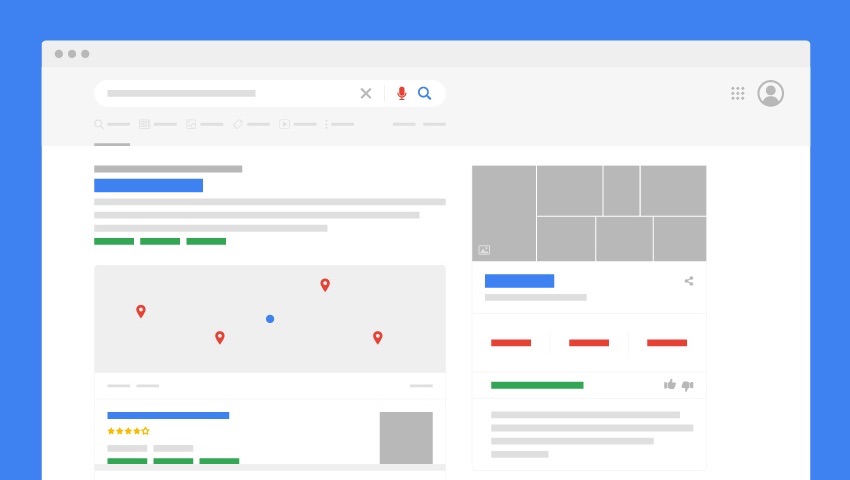
Search is our gateway to internet and advertisements/sponsered content are the backbone of search engines. In this post, I am propsing a few UX design suggesstions to the deskop search engine results pages to improve the ad revenues. These are based on analysis and benchmarking current search engine landscape. .
I have bucketized the suggestions into 3 groups based on amount of investment to implement these changes. Over the long run, this is expected to uptick the ad revenues by X%. This uptick is a result of A% increase in CTR, B% of new ad placements and C% of additional traffic
- A) Get Fitter: UX changes to improve CTR with existing ad placements [Low investment]
- B) Get Better: Modify/Introduce new ad placements + improved UX from (A) [Medium investment]
- C) Get Big: Reinvent and go big [High investment]
Below are a few Initiatives proposed across these buckets:
| Get Fitter | Get Better | Get Big |
|---|---|---|
| Search listing UX. | Better in-page ad placements | Feed based UI for search results |
| Brand Favicons + Ad labels. | Efficient use of real-estate. | Anticipatory/Predictive ads |
| Selective Attention experiments. | More Product Listing ads on search results | Async delivery for search results. |
User Behavior Background:
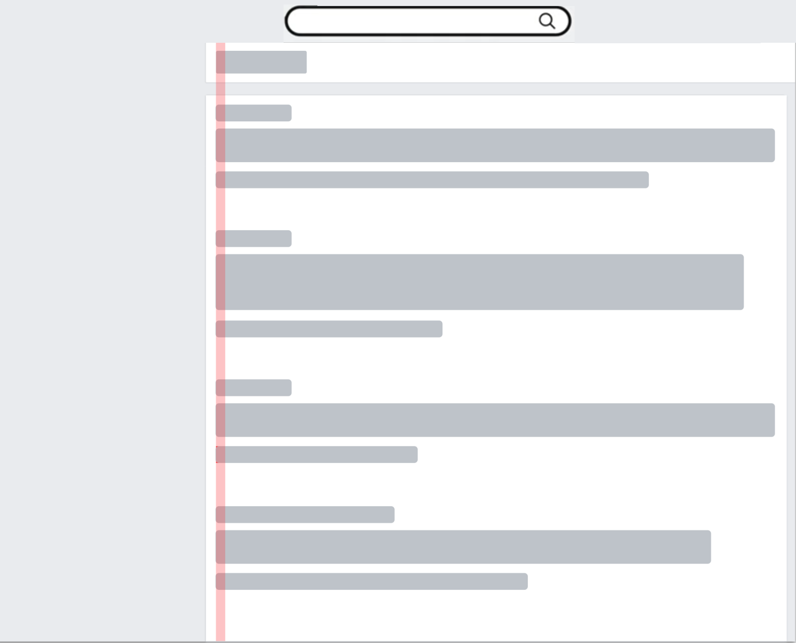
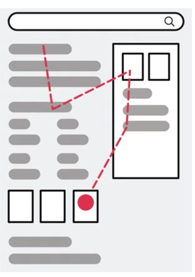
- Users scan through search results. It’s either a linear top to bottom scan (for simple search pages) or random hotspot check (for pages with images and other interactive blocks).
-
It’a rare that users go to page 2 (< X%).
-
Users are automatically trained to ignore the information they do not want to look at (Ex - URL links of search results, default ad placements and ad labels).
-
With mobile generation, a scroll is considered a casual effort and a click/touch is a costly effort during browsing.
(A) Get Fitter: Improve CTR with existing ad placements
-
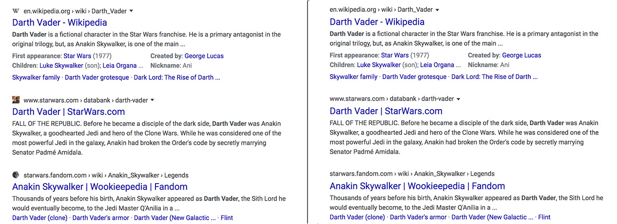
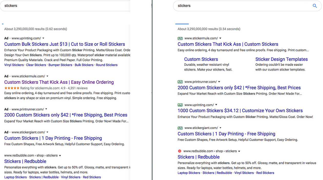
Brand Favicons + Ad labels:
Show favicons of each of the websites beside the link text of each search result. For ads use a black/gray “Ad” label.
Sample UI:
Pros:
- Users get automatically trained to look for favicons and improve the traction on ads. “Ad” tag can be experimented with options to avoid “banner blindness”.
- Such favicons improve CTR for both organic search results and ads.
- Brand awareness improves for publishers.
- Ads look more native within the content.
- Already proven on mobiles. Works well across platforms.
Cons:
- There could be some publishers/websites without favicons. Or, they may not want the same icon across all their content. This may require a new search meta data tag that needs to be provided, in which case, the crawlers need to be upgraded to identify this.
Measure of Success:
- CTR for organic search results
- CTR for ads
- Time spent by users on search results.
- Brand value improvement
- Selective Attention experiments:
Run experiments with various options to ensure users are countered from “banner blindness”. Examples:- change the Ad format, labels, backgrounds etc.
Pros:
- Counters users’ “banner blindness”.
- Better user experience and lets you figure out things iteratively.
Cons:
- Frequent changes might lead to user surprise.
Measure of Success:
- CTR for organic search results
- CTR for ads
(B) Get Better: Modify/Introduce ad placements + improve CTR
1. Better in-page ad placements:
As mentioned above, users either scan linearly or look for random spots in the ads. Some of the common hotspots are highlighted below. Place your ads below these hotspots. Choose right ad type near the hotspots (Ex - Product listing type ads at the top, text beneath images etc.). As of now Yahoo search seems to have ads only in the top and bottom of search results listing.
Pros:
- More ad placements and more traction of the users.
Cons:
- Experience might get mixed responses from users unless carefully designed.
Measure of Success:
- Increase in number of impressions.
- Increase in CTR.
-
Efficient use of real-estate.
Some of the sections such as the top of the page and “right side column” of the entire search page are not used to good extent. If carefully designed, they can work as powerful ad placements.
A few examples: Keep the right hand side ads sticky while user scrolls, refresh the ads every time user scrolls again. Choose native and product listing ads here.
As of now “car cleaning” does not show any ads. There is a good chance to use the right hand panel here to show product listing type ads.
Pros:
` `More ads resulting more revenue.
Cons:
Can get cluttered unless desinged well leading to loss of focus on search results.
Measure of Success:
- Increased placeholders for ads
- Increased impressions
- Increased CTR.
2. More Product Listing ads on search results:
Focus more on product listing style ads in search results. They can be app installs, registrations or e commerce related ads.
(C) Get Big: (Reinvent and aim big with ads)
1. Feed based UI for search results:
Scroll is always a less costly interaction than a click due to modern hardware. Hence pagination on desktop and mobile search can be replaced with feed style UI. This also solves the problem of users not visiting page 2 much. This can be experimented on mobiles first and then on desktop. Gives chance to introduce many native ads if implemented successfully.
2. Anticipatory/Predictive ads:
While a user types “hair dryer” no ads are shown but when he types “best hair dryer” ads are shown. Search has “also try” functionality which can be applied to ad keywords. Think ahed of “also try results” and show ads for those as well in the current page. Ex: When user types “hair dryer” also show ads for “best hair dryer” that makes sense.
3.Async results devilry (Push results offline):**
Find methods to deliver search data to user and use it as channel for ads. Similar to Google feed, keep pushing search/news/trending results stream as per user’s interest. This can act as a potential ad channel.